Principal Component Analysis#
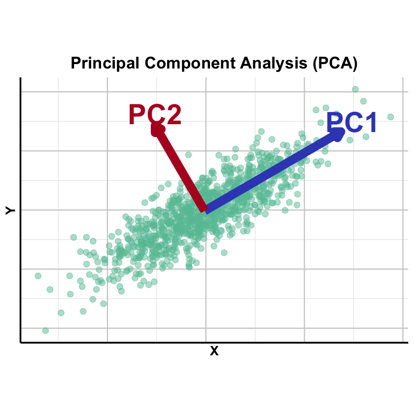
Principal Component Analysis (PCA) finds the directions in your data where the points are most spread out (maximum variance), allowing you to summarize high-dimensional data using just a few key axes of variation.
Graphical Summary#
Key Formula#
Let \(\mathbf{X}\) be an \(N \times p\) data matrix (\(N\) observations, \(p\) variables). The singular value decomposition (SVD) of \(\mathbf{X}\) can be written as
where:
\(\mathbf{L}^T=\mathbf{U}_k\mathbf{\Sigma_k}\), \(\mathbf{L}\) can be considered as the loading matrix, as in the context of factor analysis
\(\mathbf{U}_k\): \(N \times k\), each column is the left singular vector of \(\mathbf{X}\) (first \(k\) singular vectors)
\(\mathbf{\Sigma}_k\): \(k \times k\), a diagonal matrix where each element is the singular value of \(\mathbf{X}\), ordered from largest to smallest (the first \(k\) singular values)
\(\mathbf{F}=\mathbf{W}_k^T\) as the factor matrix, as in the context of factor analysis
\(\mathbf{W}_k^T\): \(k \times p\), \(\mathbf{W}_k\) consists of the first \(k\) columns of \(\mathbf{W}\), each column of which is the right singular vector of \(\mathbf{X}\)
\(\mathbf{E}\): \(N \times p\) reconstruction error (truncation error)
If all singular values are used (i.e., \(k=p\)), then \(\mathbf{E}=0\)
Technical Details#
PCA and Factor Analysis#
PCA can be considered as a special case of factor analysis with the following constraints:
\(\mathbf{U}_k\) and \(\mathbf{W}_k\) are both orthogonal matrix
Each column of \(\mathbf{U}_k\) is a unit vector of length \(N\), the left singular vector of \(\mathbf{X}\)
The diagonal elements (\(\sigma_1, \dots, \sigma_k\)) of the top part of \(\mathbf{\Sigma}_k\) is the singular values of \(\mathbf{X}\), and \(\sigma_1 \geq \sigma_2 \geq \dots \geq \sigma_k > 0\)
Each column of \(\mathbf{W}_k\) is a unit vector of length \(p\), the right singular vector of \(\mathbf{X}\)
When conducting PCA, we order the singular values by the variance \(\sigma_1 \geq \sigma_2 \geq \dots \geq \sigma_k > 0\) to reach the variance maximization by selecting the first \(k\) singular vectors.
PCA and Regression#
Factor analysis in general is similar to the concept of regression, which we introduce in Lecture: ordinary least squares. The fundamental difference is that in regression \(\mathbf{X}\) and \(\mathbf{Y}\) is fixed and the goal is to estimate \(\beta\), but in factor analysis, only \(\mathbf{Y}\) is fixed and both \(\mathbf{L}\) and \(\mathbf{F}\) is to be estimated to reach the best performance.
Specifically, PCA starts to solve for the first column of \(\mathbf{L}\) and row of \(\mathbf{F}\) that minimize the squared error in predicting \(\mathbf{X}\); the second principal component then fits the “residual” error that is left behind after removing the first principal component: i.e., it minimizes the squared error in \(\mathbf{X}\); so on, for subsequent PCs. Please refer to HGBook (box on page 191) for more details.
Scaling#
PCA is sensitive to the scaling of the variables. Mathematically this sensitivity comes from the way a rescaling changes the sample‑covariance matrix that PCA diagonalises. So in practice one needs to scale (both centered and unit variance) the matrix before performing PCA.
Eigen Decomposition and Variance Explained#
When \(\mathbf{X}\) is scaled (zero mean, unit variance), \(\mathbf{X}^T\mathbf{X}/(N-1)\) equals the sample covariance matrix. PCA via eigendecomposition finds the eigenvectors of this covariance matrix:
where \(\mathbf{\Lambda} = \mathbf{\Sigma}^T\mathbf{\Sigma}\) is a \(p\times p\) diagonal matrix of eigenvalues. The eigenvalues relate to singular values by \(\lambda_k = \sigma_k^2\) and represent variance explained along each principal direction. The proportion of variance explained by the first \(k\) PCs is:
In practice, SVD of \(\mathbf{X}\) is preferred for numerical stability, but eigendecomposition of \(\mathbf{X}^T\mathbf{X}\) provides useful perspective on the variance structure.
Terminology#
In PCA, we focus on the top \(k\) PC loadings \(\mathbf{U}_k\mathbf{\Sigma_k}\) for each individual, denoted \(\text{PC}_1, \text{PC}_2, ..., \text{PC}_k\). These are commonly visualized by plotting \(\text{PC}_1\) vs \(\text{PC}_2\) to detect outliers or population stratification. This reduces dimensionality from \(p\) to \(k\) while maximizing retained information through orthogonal components.
Example#
You have genotyped individuals and want to determine: Do they share the same genetic ancestry, or do they come from different populations? Population structure is a major confounder in association studies, making this a fundamental question in population genetics and forensics.
PCA can reveal population structure without prior knowledge of population labels. Using the same setting as Lecture: factor analysis, we’ll show how PCA easily detects four distinct groups of individuals through their principal components.
Setup#
This is the same generation as we did in the Example 1 in Lecture: factor analysis.
rm(list=ls())
set.seed(74)

N <- 50  # Number of individuals
p <- 100  # Number of markers (SNPs)
k <- 2   # Number of ancestral populations

# Create L matrix with very distinct population frequencies
F_true <- matrix(0, nrow = k, ncol = p)
# Population 1: generally higher frequencies in the first 50 SNPS, lower frequencies in the last 50
F_true[1, 1:50] <- runif(50, 0.9, 0.95)
F_true[1, 51:100] <- runif(50, 0.05, 0.1)

# Population 2: inverse pattern
F_true[2, 1:50] <- runif(50, 0.05, 0.3)
F_true[2, 51:100] <- runif(50, 0.8, 0.95)

# Add row and column names
colnames(F_true) <- paste0("SNP", 1:p)
rownames(F_true) <- paste0("POP", 1:k)

transpose_L_true <- matrix(0, nrow = N, ncol = k)

# Individuals 1-15: Pure Pop1
transpose_L_true[1:15, 1] <- 1.0
transpose_L_true[1:15, 2] <- 0.0

# Individuals 16-30: Pure Pop2
transpose_L_true[16:30, 1] <- 0.0
transpose_L_true[16:30, 2] <- 1.0

# Individuals 31-40: Pop1-Pop2 admixture (80-20)
transpose_L_true[31:40, 1] <- 0.8
transpose_L_true[31:40, 2] <- 0.2
# Individuals 41-50: Pop1-Pop2 admixture (30-70)
transpose_L_true[41:50, 1] <- 0.3
transpose_L_true[41:50, 2] <- 0.7

# Add row and column names
rownames(transpose_L_true) <- paste0("IND", 1:N)
colnames(transpose_L_true) <- paste0("POP", 1:k)

X_raw <- matrix(0, nrow = N, ncol = p)

for (i in 1:N) {
  for (j in 1:p) {
    # Expected frequency = weighted average of population frequencies
    p_ij <- sum(transpose_L_true[i, ] * F_true[ , j])

    # Sample genotype (0, 1, or 2 copies)
    X_raw[i,j] <- rbinom(1, size = 2, prob = p_ij)
  }
}

# Add row and column names
rownames(X_raw) <- paste0("IND", 1:N)
colnames(X_raw) <- paste0("SNP", 1:p)
As described above, we need to scale the X_raw first before performing PCA:
X <- scale(X_raw, center = TRUE, scale = TRUE)
PCA#
Now we apply PCA to the genotype matrix \(\mathbf{X}\) to discover the population structure.
pca_result <- prcomp(X, center = FALSE, scale. = FALSE)
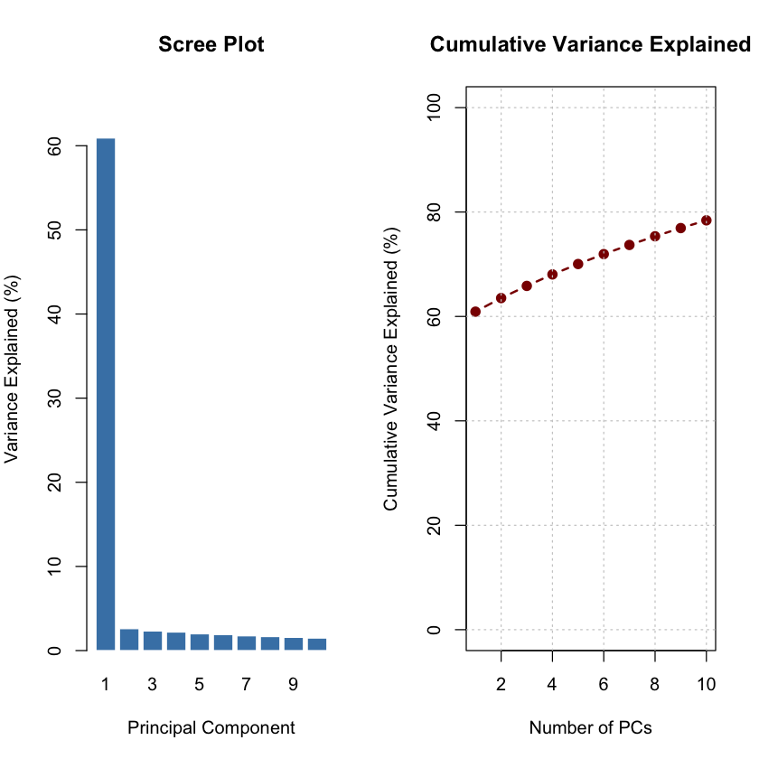
PVE by the top PCs#
The scree plot shows that the first principal component captures the majority of variance, indicating strong population differentiation.
# Extract principal component scores
pc_scores <- pca_result$x

# Calculate variance explained by each PC
variance_explained <- (pca_result$sdev^2) / sum(pca_result$sdev^2) * 100

cat("Variance explained by top 5 PCs:\n")
for (i in 1:5) {
  cat(sprintf("PC%d: %.2f%%\n", i, variance_explained[i]))
}
cat("\n")
Variance explained by top 5 PCs:
PC1: 60.92%
PC2: 2.60%
PC3: 2.33%
PC4: 2.20%
PC5: 1.99%
# Create scree plot
par(mfrow = c(1, 2), mar = c(5, 4, 4, 2))

# Barplot of variance explained
barplot(variance_explained[1:10],
        names.arg = 1:10,
        xlab = "Principal Component",
        ylab = "Variance Explained (%)",
        main = "Scree Plot",
        col = "steelblue",
        border = "white",
        ylim = c(0, max(variance_explained[1:10]) * 1.1))

# Cumulative variance explained
cumvar <- cumsum(variance_explained[1:10])
plot(1:10, cumvar,
     type = "b",
     pch = 19,
     col = "darkred",
     lwd = 2,
     xlab = "Number of PCs",
     ylab = "Cumulative Variance Explained (%)",
     main = "Cumulative Variance Explained",
     ylim = c(0, 100))
grid(col = "gray80")
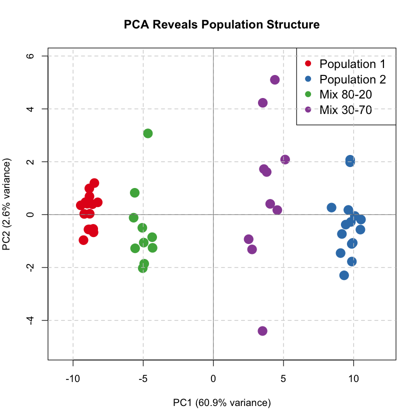
PC1 vs PC2 Colored by Population#
We plot the first two principal components, coloring individuals by their true population origin (which PCA discovers automatically!).
# Define colors for populations
pop_labels <- c(rep("Population 1", 15), rep("Population 2", 15), rep("Mix 80-20", 10), rep("Mix 30-70", 10))
pop_colors <- c("Population 1" = "#E41A1C", "Population 2" = "#377EB8", "Mix 80-20" = "#4DAF4A", "Mix 30-70" = "#984EA3")

# Create scatter plot: PC1 vs PC2
par(mfrow = c(1, 1), mar = c(5, 4, 4, 2))

plot(pc_scores[, 1], pc_scores[, 2],
     col = pop_colors[pop_labels],
     pch = 19, cex = 2,
     xlab = sprintf("PC1 (%.1f%% variance)", variance_explained[1]),
     ylab = sprintf("PC2 (%.1f%% variance)", variance_explained[2]),
     main = "PCA Reveals Population Structure",
     xlim = range(pc_scores[, 1]) * 1.15,
     ylim = range(pc_scores[, 2]) * 1.15)

legend("topright",
       legend = names(pop_colors),
       col = pop_colors,
       pch = 19,
       cex = 1.2,
       bty = "o")

grid(col = "gray80", lty = 2)
abline(h = 0, col = "gray50", lty = 1, lwd = 0.8)
abline(v = 0, col = "gray50", lty = 1, lwd = 0.8)
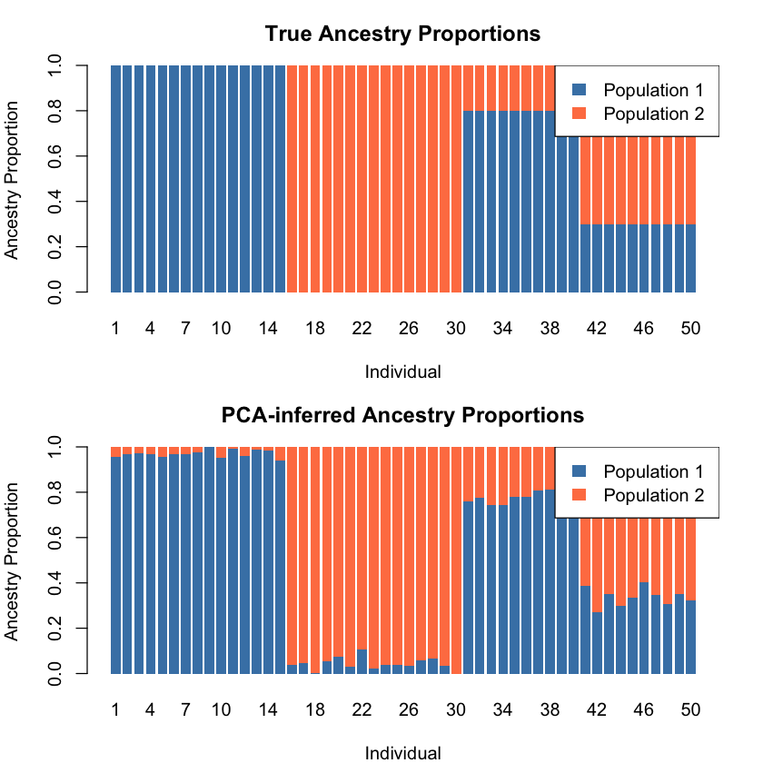
From Mixture to Admixture#
PCA captures four clusters here, but the data represents an admixture problem — individuals have varying proportions of two ancestries. As a factor analysis method, PCA can infer ancestry proportions from PC scores when population structure dominates variation (PC1 explains most variance) and populations are well-separated.
The \(k\)-th PC score for individual \(i\) is a linear combination of genotypes weighted by \(\mathbf{W}_k\):
These scores can be scaled to [0,1] to represent ancestry proportions.
Both ADMIXTURE and PCA model allele frequencies as linear combinations of \(k\) factors:
ADMIXTURE: Expected allele frequency = ancestry proportions \(\times\) population allele frequencies
PCA: Weighted combination of \(p\) variants implicitly represents ancestry through \(\mathbf{W}_k\)
For detailed PCA-STRUCTURE relationships, see Pritchard’s HGBook (pages 190-192). STRUCTURE and ADMIXTURE differ in statistical frameworks (discussed in Lecture: Bayesian versus Frequentist).
# Find the range of PC1 scores
pc1_min <- min(pc_scores[, 1])
pc1_max <- max(pc_scores[, 1])

# Estimate ancestry proportions by rescaling PC1 to [0, 1]
# This assumes: Pop1 is at pc1_min, Pop2 is at pc1_max
# Ancestry proportion for Pop2 = (PC1_score - pc1_min) / (pc1_max - pc1_min)
ancestry_pop1_pca <- (pc_scores[, 1] - pc1_min) / (pc1_max - pc1_min)
ancestry_pop2_pca <- 1 - ancestry_pop1_pca

# Create a matrix similar to the ADMIXTURE transpose_L matrix
transpose_L_pca <- t(rbind(ancestry_pop1_pca, ancestry_pop2_pca))
colnames(transpose_L_pca) <- c("POP1", "POP2")
rownames(transpose_L_pca) <- rownames(X)

# Calculate correlation between true and PCA-inferred ancestry
cor_pop1 <- cor(transpose_L_true[ , 1], transpose_L_pca[ , "POP1"])
cor_pop2 <- cor(transpose_L_true[ , 2], transpose_L_pca[ , "POP2"])

cat("Correlation between true and PCA-inferred ancestry proportions:\n")
cat(sprintf("Population 1: %.4f\n", cor_pop1))
cat(sprintf("Population 2: %.4f\n", cor_pop2))
Correlation between true and PCA-inferred ancestry proportions:
Population 1: -0.9976
Population 2: -0.9976
Since the correlations are all close to -1, we need to flip the populations.
transpose_L_pca_flipped <- transpose_L_pca[, c("POP2", "POP1")]
# Visualize the comparison using same style as ADMIXTURE
par(mfrow = c(2, 1), mar = c(4, 4, 3, 2))

# True ancestry
barplot(t(transpose_L_true), col = c("steelblue", "coral"), border = NA,
        main = "True Ancestry Proportions",
        xlab = "Individual", ylab = "Ancestry Proportion",
        names.arg = 1:N)
legend("topright", legend = c("Population 1", "Population 2"),
       fill = c("steelblue", "coral"), border = NA)

# PCA-inferred ancestry
barplot(t(transpose_L_pca_flipped), col = c("steelblue", "coral"), border = NA,
        main = "PCA-inferred Ancestry Proportions",
        xlab = "Individual", ylab = "Ancestry Proportion",
        names.arg = 1:N)
legend("topright", legend = c("Population 1", "Population 2"),
       fill = c("steelblue", "coral"), border = NA)
While PCA can visualize population structure, for admixture analysis it is better to use the ADMIXTURE model introduced in Factor Analysis. Here’s why:
PCA is a descriptive method: PCA finds the directions of maximum variance in the data but does not provide a statistical model of how the data was generated
ADMIXTURE is a generative model: ADMIXTURE explicitly models the genetic mixture as a weighted combination of ancestry components: \(\mathbf{X} = \mathbf{L}^T\mathbf{F} + \mathbf{E}\) (check Factor Analysis for more details)
Interpretation of Loadings for PC1#
Here we show that actually the loading for PC1 actually captures the difference of the allele frequencies between the two ancestries:
# Extract PC loadings (weights for each SNP)
pc1_loadings <- pca_result$rotation[, 1]
pc2_loadings <- pca_result$rotation[, 2]

# Calculate allele frequency for each population at each SNP
pop1_freq <- colMeans(X_raw[1:15, ]) / 2   # Pure Population 1
pop2_freq <- colMeans(X_raw[16:30, ]) / 2  # Pure Population 2

# Calculate allele frequency difference between populations
freq_diff <- pop2_freq - pop1_freq

# Show correlations
cor_pc1_freqdiff <- cor(pc1_loadings, freq_diff)

cat("\n=== PC Loadings and Allele Frequency Differences in the Raw Data ===\n")
cat(sprintf("Correlation between PC1 loadings and freq differences (raw data): %.4f\n", cor_pc1_freqdiff))
=== PC Loadings and Allele Frequency Differences in the Raw Data ===
Correlation between PC1 loadings and freq differences (raw data): 0.9975
And this correlation persists after the scaling of input data as well:
# Calculate allele frequency for each population at each SNP
pop1_freq_scaled <- colMeans(X[1:15, ]) / 2   # Pure Population 1
pop2_freq_scaled <- colMeans(X[16:30, ]) / 2  # Pure Population 2

# Calculate allele frequency difference between populations
freq_diff_scaled <- pop2_freq_scaled - pop1_freq_scaled

# Show correlations
cor_pc1_freqdiff_scaled <- cor(pc1_loadings, freq_diff_scaled)

cat("\n=== PC Loadings and Allele Frequency Differences After Scaling the Data ===\n")
cat(sprintf("Correlation between PC1 loadings and freq differences (scaled data): %.4f\n", cor_pc1_freqdiff_scaled))
cat("\n")
=== PC Loadings and Allele Frequency Differences After Scaling the Data ===
Correlation between PC1 loadings and freq differences (scaled data): 0.9985
Supplementary#
Graphical Summary#
library(ggplot2)

# Set seed for reproducibility
set.seed(42)

# Generate correlated 2D data with PC1 >> PC2
n <- 1000
theta <- pi/6  # 30 degree tilt

# Create elongated cloud - PC1 much longer than PC2
x <- rnorm(n, 0, 3)    # Large variance for PC1 direction
y <- rnorm(n, 0, 0.8)  # Small variance for PC2 direction

# Rotate to create diagonal spread
X_original <- x * cos(theta) - y * sin(theta)
Y_original <- x * sin(theta) + y * cos(theta)

data <- data.frame(X = X_original, Y = Y_original)

# Perform PCA
pca <- prcomp(data, center = TRUE, scale. = FALSE)

# Get PC directions - flip if needed
pc1_direction <- -pca$rotation[, 1]
pc2_direction <- -pca$rotation[, 2]

# Scale for visualization
scale_factor1 <- 8
scale_factor2 <- 5
pc1_end <- scale_factor1 * pc1_direction
pc2_end <- scale_factor2 * pc2_direction

# Get the center (mean)
center_x <- mean(X_original)
center_y <- mean(Y_original)

# Create the plot
p_PCA <- ggplot(data, aes(x = X, y = Y)) +
  geom_point(color = "#66C2A5", alpha = 0.5, size = 3) +

  # PC1 arrow (blue) - use annotate instead of geom_segment
  annotate("segment",
           x = center_x, y = center_y,
           xend = center_x + pc1_end[1],
           yend = center_y + pc1_end[2],
           arrow = arrow(length = unit(0.3, "cm"), type = "closed"),
           color = "#3B4CC0", linewidth = 5) +
  annotate("text", x = center_x + pc1_end[1] + 0.6,
           y = center_y + pc1_end[2] + 0.5,
           label = "PC1", color = "#3B4CC0", size = 12, fontface = "bold") +

  # PC2 arrow (purple) - use annotate instead of geom_segment
  annotate("segment",
           x = center_x, y = center_y,
           xend = center_x + pc2_end[1],
           yend = center_y + pc2_end[2],
           arrow = arrow(length = unit(0.3, "cm"), type = "closed"),
           color = "#B40426", linewidth = 5) +
  annotate("text", x = center_x + pc2_end[1],
           y = center_y + pc2_end[2] + 0.6,
           label = "PC2", color = "#B40426", size = 12, fontface = "bold") +

  # Styling
  labs(title = "Principal Component Analysis (PCA)",
       x = "X", y = "Y") +
  theme_minimal(base_size = 14) +
  theme(
    plot.title = element_text(hjust = 0.5, size = 20, face = "bold"),
    axis.title.x = element_text(size = 16, face = "bold"),
    axis.title.y = element_text(size = 16, face = "bold"),
    axis.text = element_blank(),
    panel.grid.major = element_line(color = "gray80"),
    panel.grid.minor = element_line(color = "gray90"),
    axis.line = element_line(color = "black", linewidth = 1),
    plot.background = element_rect(fill = "transparent", color = NA),
    panel.background = element_rect(fill = "transparent", color = NA)
  ) +
  coord_fixed(ratio = 1)

# Save with transparent background
ggsave("./figures/PCA.png", plot = p_PCA, width = 18, height = 12,
       units = "in", dpi = 300, bg = "transparent")

print(p_PCA)
Extended Reading#
An Owner’s Guide to the Human Genome: an introduction to human population genetics, variation and disease, by Jonathan Pritchard, Stanford University (Chapter 3.1 and 3.2)
Novembre, J., Johnson, T., Bryc, K. et al. Genes mirror geography within Europe. Nature 456, 98–101 (2008). https://doi.org/10.1038/nature07331
Novembre, J., Stephens, M. Interpreting principal component analyses of spatial population genetic variation. Nat Genet 40, 646–649 (2008). https://doi.org/10.1038/ng.139
Patterson, Nick, Alkes L. Price, and David Reich. “Population structure and eigenanalysis.” PLoS genetics 2.12 (2006): e190. https://journals.plos.org/plosgenetics/article?id=10.1371/journal.pgen.0020190