Likelihood#
Likelihood is the plausibility of observing your data given a specific model or parameter value.
Graphical Summary#
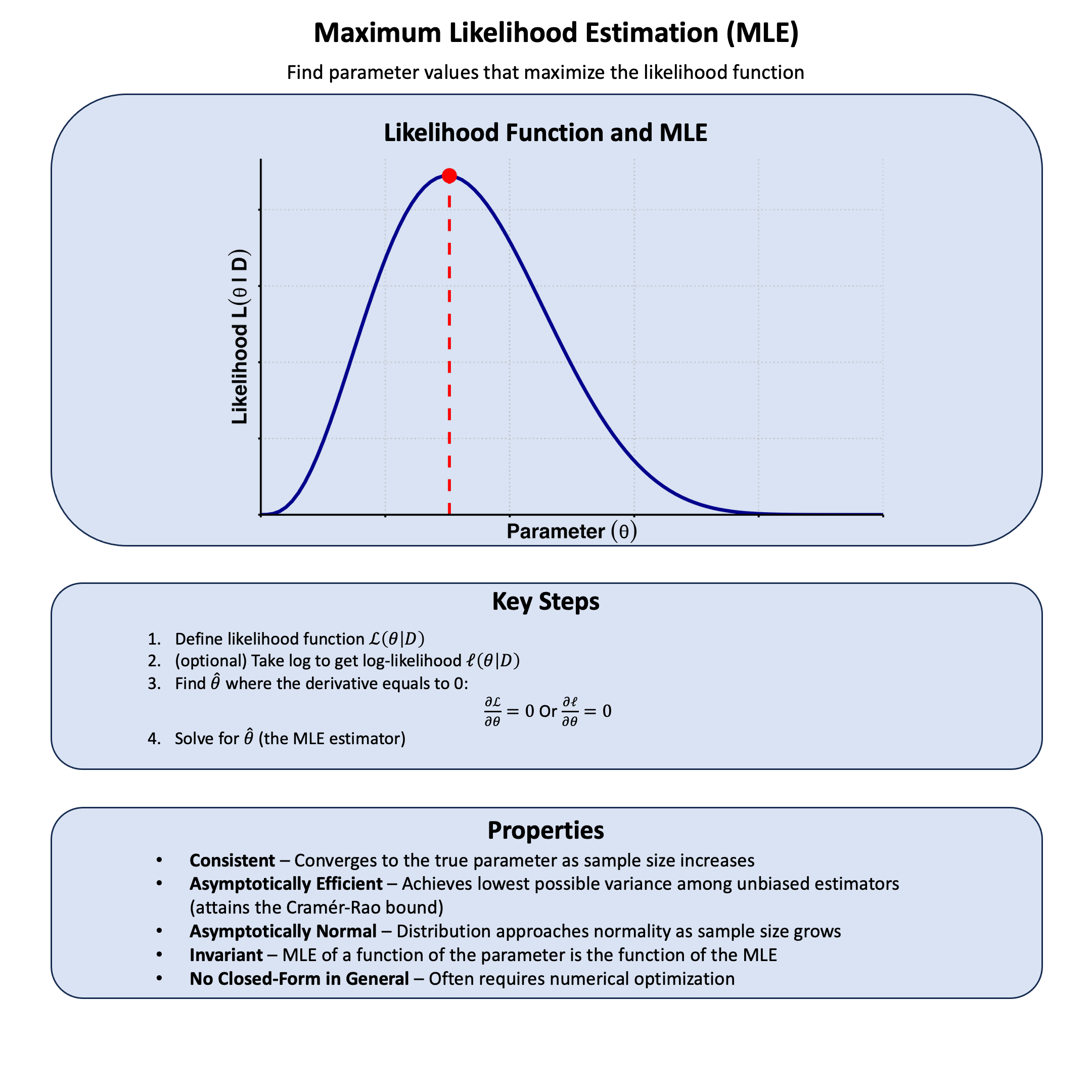
Key Formula#
The likelihood for a model \(\text{M}\) based on data \(\text{D}\) is:
Where:
\(\mathcal{L}\) is the likelihood function for model \(\text{M}\) under data \(\text{D}\)
\(\text{M}\) represents the model
\(\text{D}\) represents the observed data
\(P(\text{D}|\text{M})\) is the probability of observing data \(\text{D}\) given the model \(\text{M}\)
Technical Details#
From Single to Multiple Samples#
For a single observation \(\text{D}_1\):
For multiple independent observations \(\textbf{D} = \{\text{D}_1,\dots,\text{D}_N \}\), the joint probability of multiple independent samples is the product of their individual probabilities:
Log-Likelihood#
We often work with log-likelihood (rather than the likelihood itself) for computational stability:
The \(\log\) transformation is a monotonic function which converts products to sums, making calculations easier and preventing numerical underflow with very small probabilities.
In this series of lectures, unless otherwise specified, we use log base e.
Example#
Assuming that we are interested in the effect of a genetic variant on the height measurement with five available samples, we want to compare the following three models:
Model 1: no genetic effect (\(\beta=0\))
Model 2: moderate genetic effect (\(\beta=0.5\))
Model 3: large genetic effect (\(\beta=1.0\))
How do I know from the data which model is most plausible?
This is where likelihood comes in - it helps us evaluate how well each model explains our observed data. We’ll generate some example data where we know the true effect size (\(\beta = 0.4\)), then calculate the likelihood under each of our three theories to see which one the data supports most strongly.
Setup#
Let’s first generate the genotype data and trait values for 5 individuals.
# Clear the environment
rm(list = ls())
set.seed(19)  # For reproducibility

# Generate genotype data for 5 individuals at a single variant
N <- 5
genotypes <- c("CC", "CT", "TT", "CT", "CC")  # Individual genotypes
names(genotypes) <- paste("Individual", 1:N)

# Define alternative allele
alt_allele <- "T"

# Convert to additive genotype coding (count of alternative alleles)
Xraw_additive <- numeric(N)
for (i in 1:N) {
  alleles <- strsplit(genotypes[i], "")[[1]]
  Xraw_additive[i] <- sum(alleles == alt_allele)
}
names(Xraw_additive) <- names(genotypes)

# Standardize genotypes
X <- scale(Xraw_additive, center = TRUE, scale = TRUE)[,1]
# Set true beta and generate phenotype data
true_beta <- 0.4
true_sd <- 1.0

# Generate phenotype with true effect
Y <- X * true_beta + rnorm(N, 0, true_sd)
Likelihood and Log-likelihood#
Now, let’s create two functions to compute the likelihood and log-likelihood under different models (in this case, different \(\beta\) values) for the effect of a genetic variant on height:
# Likelihood function for normal distribution
likelihood <- function(beta, sd, X, Y) {
  # Calculate expected values under the model
  mu <- X * beta
  # Calculate likelihood (product of normal densities)
  prod(dnorm(Y, mean = mu, sd = sd, log = FALSE))
}

# Log-likelihood function (more numerically stable)
log_likelihood <- function(beta, sd, X, Y) {
  # Calculate expected values under the model
  mu <- X * beta
  # Calculate log-likelihood (sum of log normal densities)
  sum(dnorm(Y, mean = mu, sd = sd, log = TRUE))
}
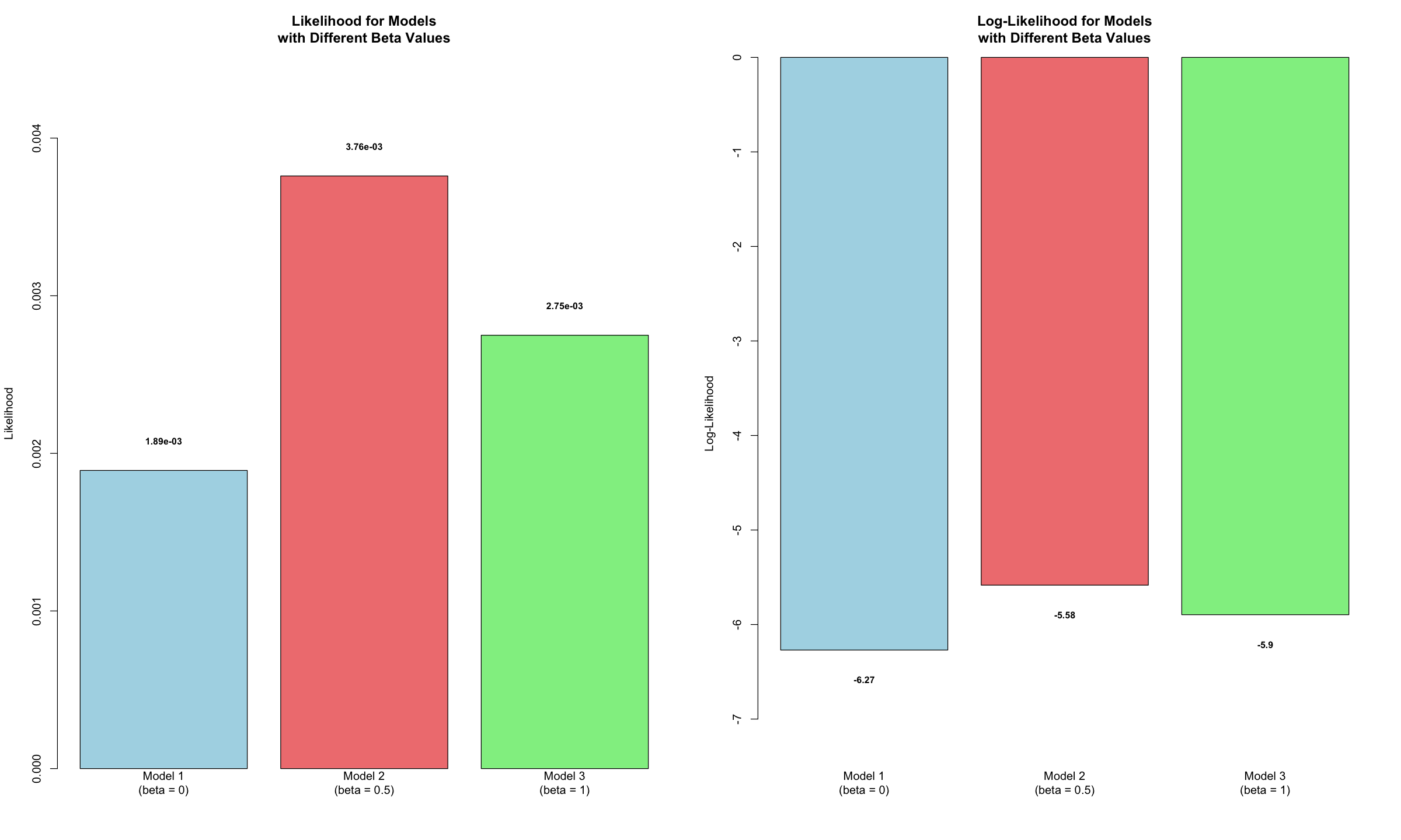
Now, let’s apply this function to our three models:
# Test three different models with different beta values
beta_values <- c(0, 0.5, 1.0)  # Three different effect sizes to test
model_names <- paste0("Model ", 1:3, "\n(beta = ", beta_values, ")")

# Calculate likelihoods and log-likelihoods
results <- data.frame(
  Model = model_names,
  Beta = beta_values,
  Likelihood = numeric(3),
  Log_Likelihood = numeric(3)
)

for (i in 1:3) {
  results$Likelihood[i] <- likelihood(beta = beta_values[i], sd = true_sd, X = X, Y = Y)
  results$Log_Likelihood[i] <- log_likelihood(beta = beta_values[i], sd = true_sd, X = X, Y = Y)
}
Results and Visualization#
results
| Model | Beta | Likelihood | Log_Likelihood |
|---|---|---|---|
| <chr> | <dbl> | <dbl> | <dbl> |
| Model 1 (beta = 0) | 0.0 | 0.001891561 | -6.270353 |
| Model 2 (beta = 0.5) | 0.5 | 0.003759907 | -5.583361 |
| Model 3 (beta = 1) | 1.0 | 0.002749409 | -5.896369 |
Let’s visualize the likelihood and log-likelihood for these three models. A higher value in either metric indicates a stronger fit, suggesting the data provides greater support for that specific model.
options(repr.plot.width = 20, repr.plot.height = 12)

# 1. Setup the side-by-side layout (1 row, 2 columns)
par(mfrow = c(1, 2))

# 2. Create barplot of Likelihoods
# We increase the top margin slightly to fit the scientific notation labels
barplot(results$Likelihood,
        names.arg = results$Model,
        main = "Likelihood for Models\nwith Different Beta Values",
        ylab = "Likelihood",
        col = c("lightblue", "lightcoral", "lightgreen"),
        border = "black",
        ylim = c(0, max(results$Likelihood) * 1.2)) # 20% extra space for labels

# Add scientific notation values on top
text(x = seq(0.7, by = 1.2, length.out = length(results$Model)),
     y = results$Likelihood + max(results$Likelihood) * 0.05,
     labels = format(results$Likelihood, scientific = TRUE, digits = 3),
     cex = 0.8,
     font = 2)

# 3. Create barplot of Log-Likelihoods
barplot(results$Log_Likelihood,
        names.arg = results$Model,
        main = "Log-Likelihood for Models\nwith Different Beta Values",
        ylab = "Log-Likelihood",
        col = c("lightblue", "lightcoral", "lightgreen"),
        border = "black",
        # Log-likelihood is negative, so we extend the bottom of the Y axis
        ylim = c(min(results$Log_Likelihood) * 1.2, 0))

# Add rounded values below the bars
text(x = seq(0.7, by = 1.2, length.out = length(results$Model)),
     y = results$Log_Likelihood - abs(min(results$Log_Likelihood)) * 0.05,
     labels = round(results$Log_Likelihood, 2),
     cex = 0.8,
     font = 2)

# 4. Reset layout to default (optional)
par(mfrow = c(1, 1))
Supplementary#
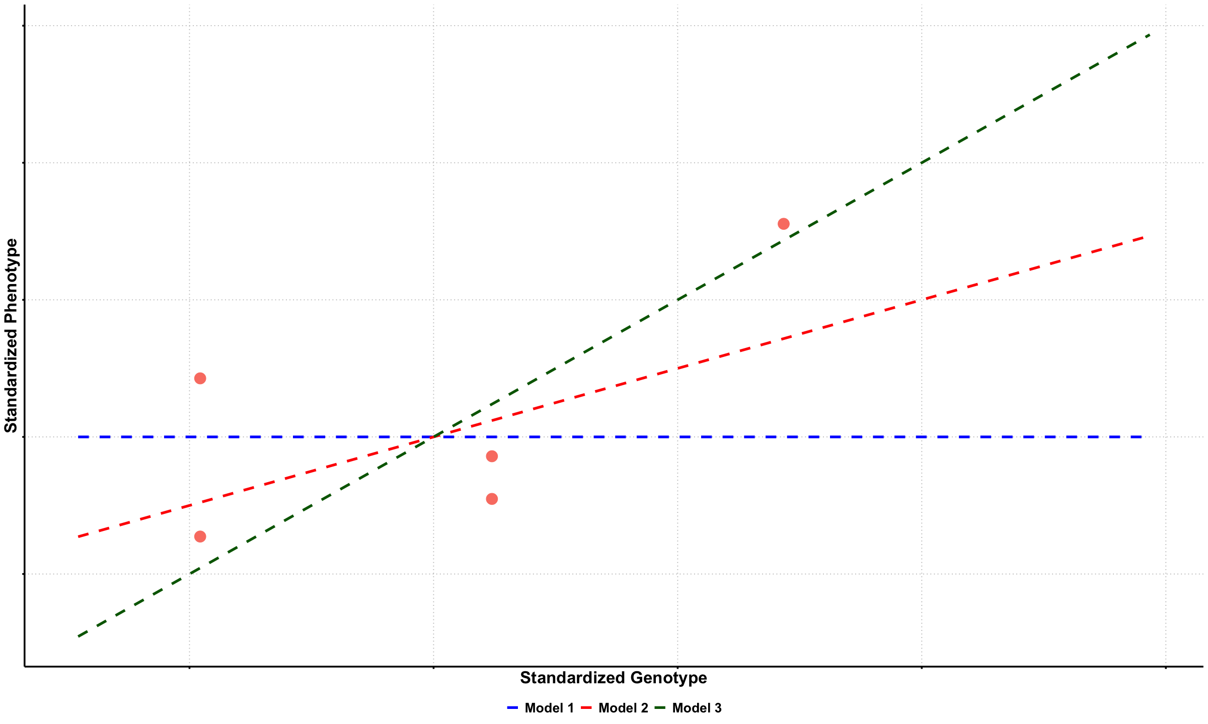
Graphical Summary#
library(ggplot2)
df_scatter <- data.frame(
  Genotype = X,
  Phenotype = Y
)

# Create plot
p1a <- ggplot(df_scatter, aes(x = Genotype, y = Phenotype)) +
  geom_point(color = "salmon", size = 6) +
  labs(
    x = "Standardized Genotype",
    y = "Standardized Phenotype"
  ) +
  theme_minimal() +
  theme(
    # Font styling
    text = element_text(size = 18, face = "bold"),
    axis.title = element_text(size = 20, face = "bold"),

    # Hide axis tick labels
    axis.text.x = element_blank(),
    axis.text.y = element_blank(),

    # Customize grid and axes
    panel.grid.major = element_line(color = "gray", linetype = "dotted"),
    panel.grid.minor = element_blank(),
    axis.line = element_line(linewidth = 1),
    axis.ticks = element_line(linewidth = 1),

    # Transparent background
    panel.background = element_rect(fill = "transparent", color = NA),
    plot.background = element_rect(fill = "transparent", color = NA)
  )

# Create sequence of x values for smooth lines
x_vals <- seq(min(X) - 0.5, max(X) + 1.5, length.out = 100)

# Create updated data frame for lines
lines_df <- data.frame(
 Genotype = rep(x_vals, 3),
 Phenotype = c(
   0 * x_vals,
   0.5 * x_vals,
   1 * x_vals
 ),
 Model = factor(rep(c("Model 1", "Model 2", "Model 3"), each = length(x_vals)),
                levels = c("Model 1", "Model 2", "Model 3"))
)

# Add dashed lines with plain labels
p1b <- p1a +
 geom_line(data = lines_df, aes(x = Genotype, y = Phenotype, color = Model, linetype = Model), linewidth = 1.5) +
 scale_color_manual(values = c("Model 1" = "blue", "Model 2" = "red", "Model 3" = "darkgreen")) +
 scale_linetype_manual(values = c("Model 1" = "dashed", "Model 2" = "dashed", "Model 3" = "dashed")) +
 theme(
   legend.title = element_blank(),
   legend.position = "bottom",
   legend.text = element_text(size = 16, face = "bold")
 )

# Show and save plot
print(p1b)
ggsave("./figures/likelihood_data_fitted.png", plot = p1b,
      width = 6, height = 6, dpi = 300, bg = "transparent")
# Create a data frame for likelihood curves
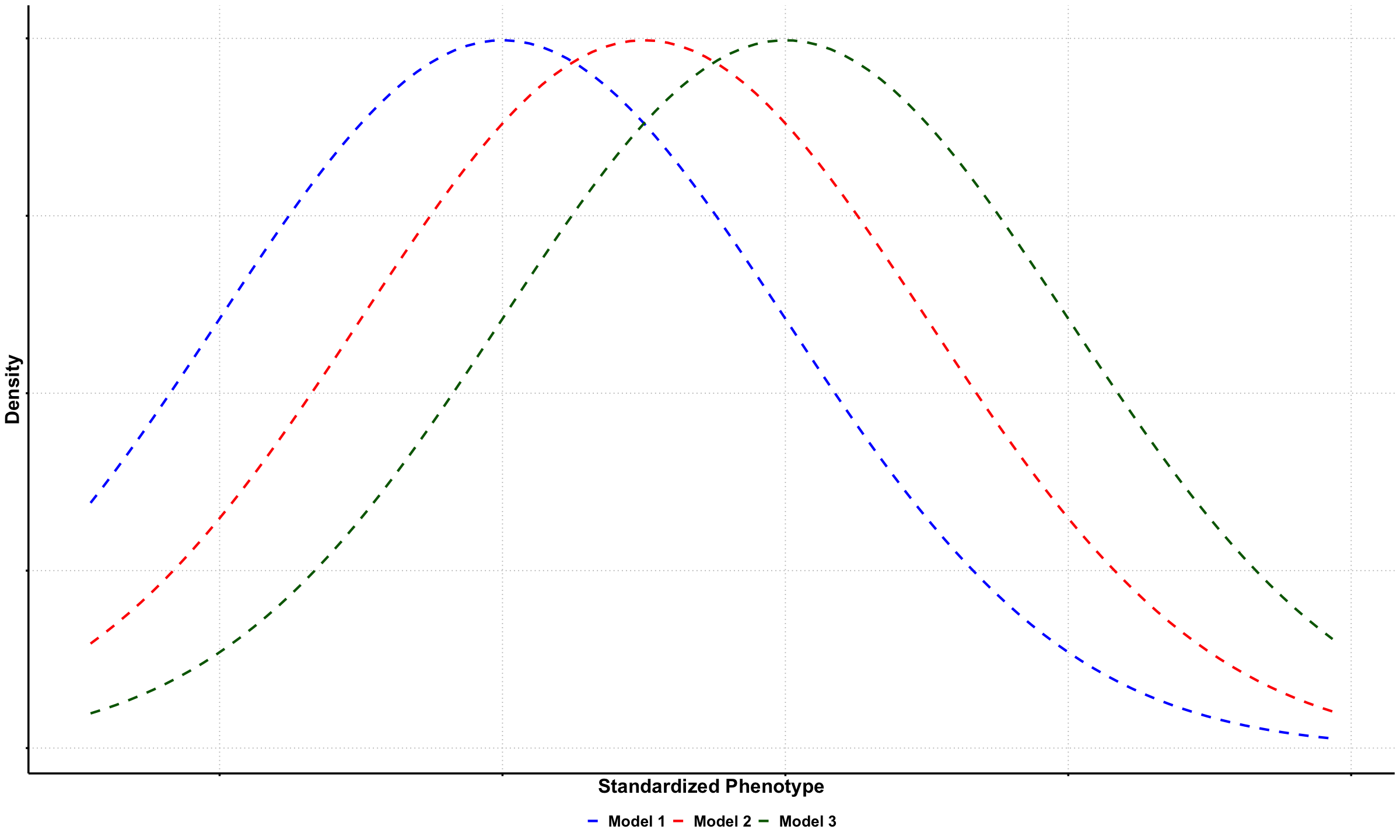
baseline <- 0 # baseline for standardized data
genotype <- 1 # example genotype value for visualization
df_likelihood <- data.frame(
Phenotype = x_vals,
`beta = 0` = dnorm(x_vals, mean = baseline, sd = true_sd),
`beta = 0.5` = dnorm(x_vals, mean = baseline + 0.5 * genotype, sd = true_sd),
`beta = 1` = dnorm(x_vals, mean = baseline + 1 * genotype, sd = true_sd)
)
# Reshape to long format
df_long_lik <- reshape2::melt(df_likelihood, id.vars = "Phenotype",
variable.name = "Model", value.name = "Density")
levels(df_long_lik$Model) <- c("Model 1", "Model 2", "Model 3")
# Plot the likelihood curves
p2 <- ggplot(df_long_lik, aes(x = Phenotype, y = Density, color = Model, linetype = Model)) +
geom_line(linewidth = 1.2) +
scale_color_manual(values = c("Model 1" = "blue", "Model 2" = "red", "Model 3" = "darkgreen")) +
scale_linetype_manual(values = c("Model 1" = "dashed", "Model 2" = "dashed", "Model 3" = "dashed")) +
labs(
x = "Standardized Phenotype",
y = "Density"
) +
theme_minimal() +
theme(
text = element_text(size = 18, face = "bold"),
axis.title = element_text(size = 20, face = "bold"),
axis.text.x = element_blank(),
axis.text.y = element_blank(),
panel.grid.major = element_line(color = "gray", linetype = "dotted"),
panel.grid.minor = element_blank(),
axis.line = element_line(linewidth = 1),
axis.ticks = element_line(linewidth = 1),
panel.background = element_rect(fill = "transparent", color = NA),
plot.background = element_rect(fill = "transparent", color = NA),
legend.title = element_blank(),
legend.position = "bottom",
legend.text = element_text(size = 16, face = "bold")
)
# Show and save the plot
print(p2)
ggsave("./figures/likelihood_density.png", plot = p2,
width = 6, height = 6, dpi = 300, bg = "transparent")